From Clicks to Insights: Visualizing Blog Data with Jupyter
Introduction

2025 was a very productive year. I worked on a lot of projects and initiatives, and this blog was one of them. Over the year I published 12 articles - my original goal was 10, but I also dusted off a few older write-ups and gave them fresh life. I’m really happy the way posts resonated with people. The warm feedback made all the effort worth it.
Now it’s time to peek at the numbers this blog produced. I want to see the trends and turn raw logs into something a little more meaningful. Think of it like counting muffins after a bake sale - let’s see which flavors were a hit. Let the analysis begin!
Tooling
If you read “Under the Hood of my Blog”, you know I don’t use Google Analytics or other tracking platforms. That was deliberate: I wanted to avoid cookie banners and GDPR consent headaches. Instead I rely on CloudFront access logs. They’re not glamorous, but they hold plenty of useful info.
You can query those logs with AWS Athena. Athena is handy, but I wanted to iterate quickly, make charts, and avoid per-query charges. So I reached for another tool - Jupyter.
Jupyter
As per official documentation:
JupyterLab is the latest web-based interactive development environment for notebooks, code, and data. Its flexible interface allows users to configure and arrange workflows in data science, scientific computing, computational journalism, and machine learning. A modular design invites extensions to expand and enrich functionality.
In plain terms, Jupyter gives you an interactive environment where you can run small chunks of code, inspect results, and tweak things quickly. It’s like a lab bench: you can test one step at a time without redoing everything. Interpreted languages such as Python work great here because they let you iterate fast. Load your data into memory once, then re-run only the transformation or visualization cells - no need to reboil the whole kettle.
Now, let’s see how I used Jupyter for this analysis idea.
Setup
First, we need to install Python and Jupyter. This can be done by following the official Python and Jupyter documentation.
Next, download the CloudFront logs from S3. CloudFront creates many small files per day, so using the S3 console to download them one by one is tedious. I used the AWS CLI to sync the bucket to a local folder:
aws s3 sync s3://<my bucket> ./data
Note: Downloading all data from the S3 bucket would be far more expensive than running a few Athena queries, so we’ll ignore cost considerations for the sake of simplicity.
Then start Jupyter from the folder with your data:
jupyter notebook
A browser tab will open with an empty workspace. Create a new notebook (File → New → Notebook) and pick your Python kernel.
Notebooks are made of cells - code cells, markdown, and raw text - like recipe steps you can execute independently. Jupyter is a very powerful tool with many features, so feel free to check the official documentation.
Now let’s write some code!
Loading Data
First, we need to import the libraries we’ll use. I mostly use pandas for data work, pandasql when I want quick SQL-style queries, and matplotlib for charts.
import pandas as pd
from pandasql import sqldf
pysqldf = lambda q: sqldf(q)
import matplotlib.pyplot as plt
Next, we read the logs into a DataFrame. In pandas, a DataFrame is basically a table of rows and columns - think spreadsheet or a neatly organized filing cabinet.
df = pd.read_parquet('./data')Then we can check the first few rows and how many rows we have:
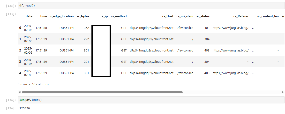
Great - data is loaded. Now let’s prepare it for analysis.
Transformation
Before we analyze, we need to clean and normalize the data. In data engineering we often talk about bronze, silver, and gold data tiers - I won’t debate purity here, I just want something easy to work with.
My goals:
- Normalize URIs - remove trailing slashes
- Combine date and time into a timestamp and convert it into a UNIX timestamp
- Keep only rows that correspond to blog post pages - ignore images, API calls and bots hitting random URIs
Here’s a simple and readable way to do that with pandas:
// Remove trailing slash
df['uri'] = df.apply(lambda a : a.cs_uri_stem.rstrip('/'), axis=1)
// Create timestamp column
df['timestamp'] = df.apply(lambda a : a.date + ' ' + a.time, axis=1)
// Create UNIX timestamp column
df['unix_timestamp'] = df.apply(lambda a : pd.Timestamp(a.timestamp).timestamp(), axis=1)
// Select only relevant columns and rows
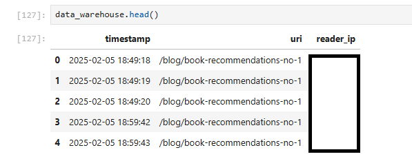
data_warehouse = pysqldf("SELECT timestamp, uri, c_ip as reader_ip FROM df WHERE uri IN
('/blog/automating-security-with-devsecops', '/blog/agentic-ai', '/blog/book-recommendations-no-1', '/blog/book-recommendations-no-2',
'/blog/kubernetes-crash-course', '/blog/recommended-ai-study-material', '/blog/technical-modernization-part-1',
'/blog/technical-modernization-part-2', '/blog/the-importance-of-side-projects', '/blog/under-the-hood-of-my-blog', '/blog/your-knowledge-your-ai')")Now we have a compact DataFrame (data_warehouse) with the columns we need.
Analysis
First, I wanted to know the total number of reads per post.
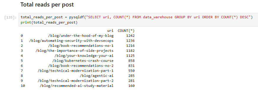
Nice - but those numbers can be misleading: someone might refresh a page repeatedly or re-read posts. A better approach is to count unique readers, which we can approximate by using IP addresses to identify distinct visitors.
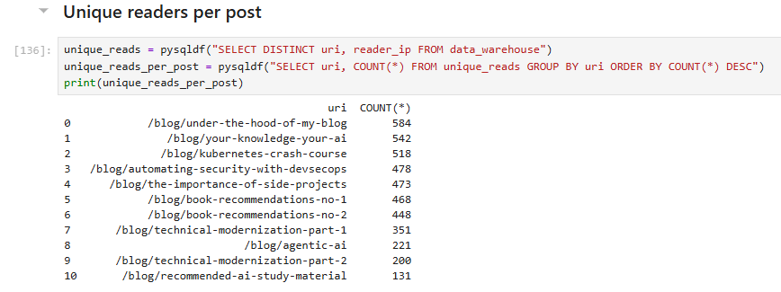
Unsurprisingly, the totals drop when counting uniques, but they’re still impressive. When I started this blog, I never imagined I would reach 500 readers!
Next, we can estimate how many “true fans” we have - people (or bots) who have read every post.
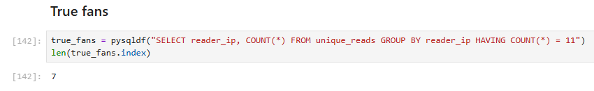
The result: lucky seven. If you’re among them, kudos!
Now let’s analyze daily reads - how many reads we get each day. I visualized this with a chart to make the data clearer and more useful. I added markers for the dates when I shared new posts on social media. LinkedIn doesn’t provide precise posting dates, so I used my Facebook timeline as a proxy; the markers may therefore be approximate.
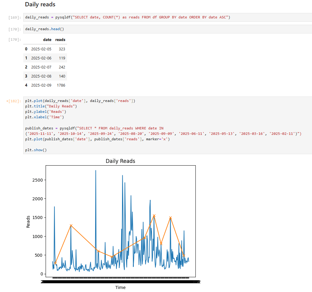
The chart looks great: we can see a clear correlation between spikes in reads and social media shares.
Finally, let’s wrap up the analysis with a fancier metric - the “reading tail.” This shows the distribution of reads over the days after publication. To compute it, I used more advanced Jupyter Notebook features, such as creating derived columns and applying transformations.
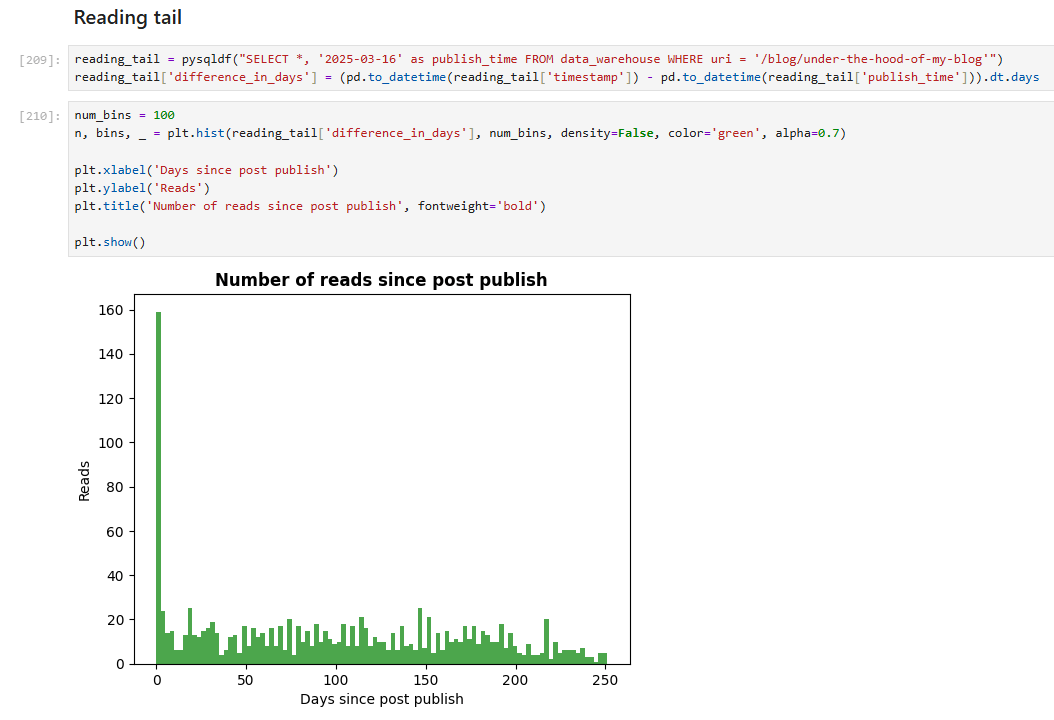
This chart shows data for the most-read post, “Under the Hood of My Blog.” As expected, reads peak in the first days after publication and decline over time.
Year Wrap-up
It was enjoyable to combine two topics today: Jupyter and data analysis using relatable data. I’m delighted by numbers I never dreamed of, and I hope they reflect the usefulness and interest of my posts.
I’ll continue writing next year, though I am getting up to speed in the new job and new role (expect SRE related topics!) and have ideas planned for 2026, so I’ll publish less frequently, yet I want to ensure that each post is useful, relatable and provides you with applicable knowledge.
Thank you all for reading. Happy holidays, and see you in 2026!